identity


I was asked to create a standardized logo for California Optical, a small business based in Upland, California. They provide eye exams, eyeglasses, sunglasses, and contact lenses for adults and children. See my process below.
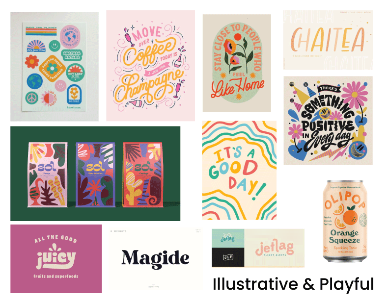
I. Moodboarding
I first began my process by providing 2 sets of moodboards to the client based on specific characteristics and value propositions heralded by the business.

II. Sketching
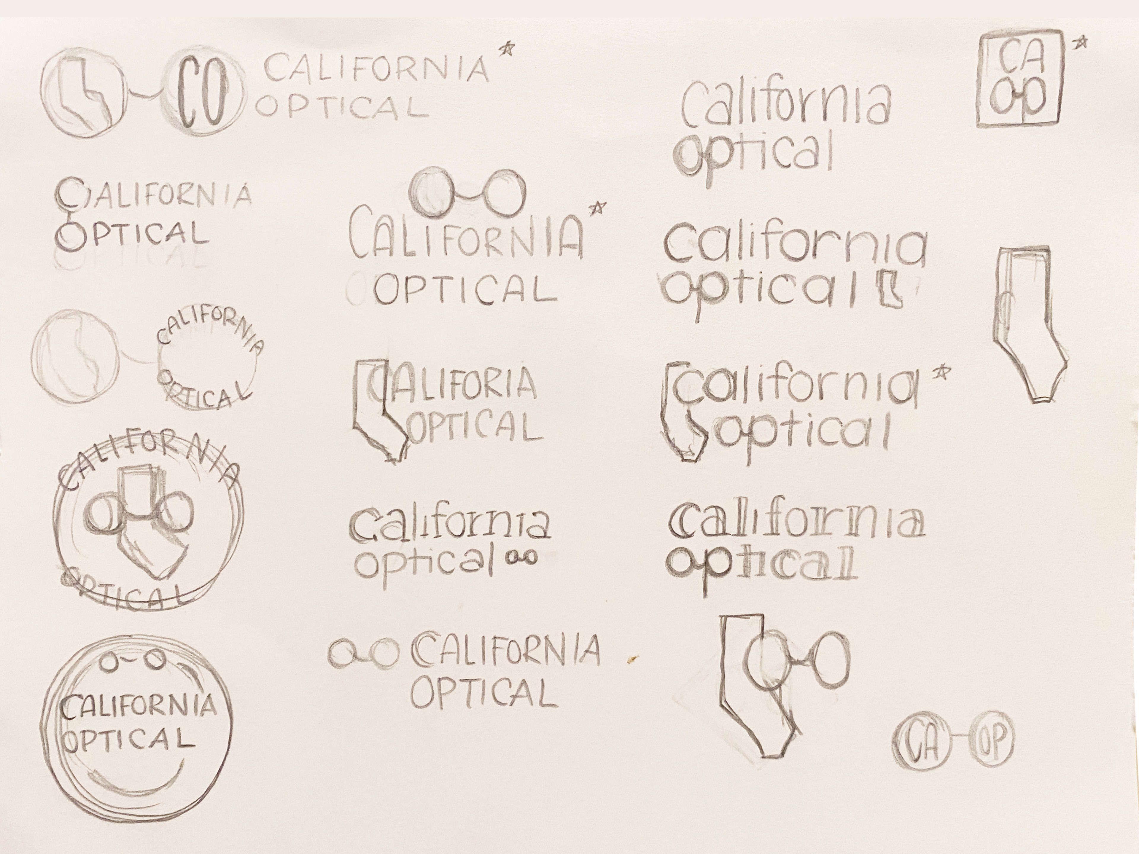
The client opted to go in the direction of "Traditional and Refined". From there, I went back to the client's original ask to include imagery with glasses and began hand sketching options. I then went into Illustrator and began refining my sketches, focusing on typography and shapes.
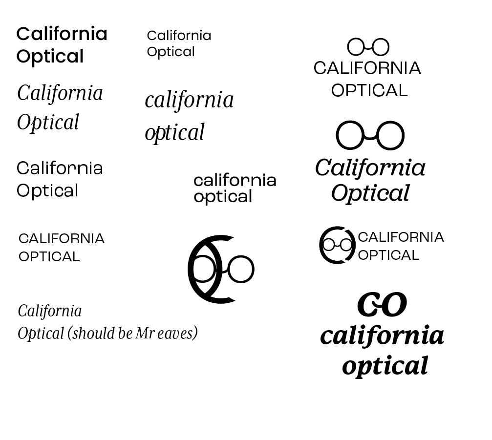

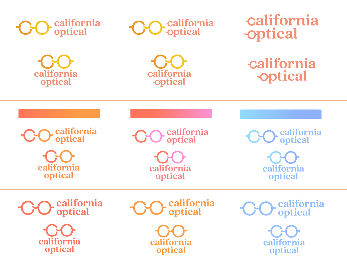
III. Iteration
After finding a couple typefaces and lockup directions, I started iterating with color and manipulating the type and icon to create lockups.

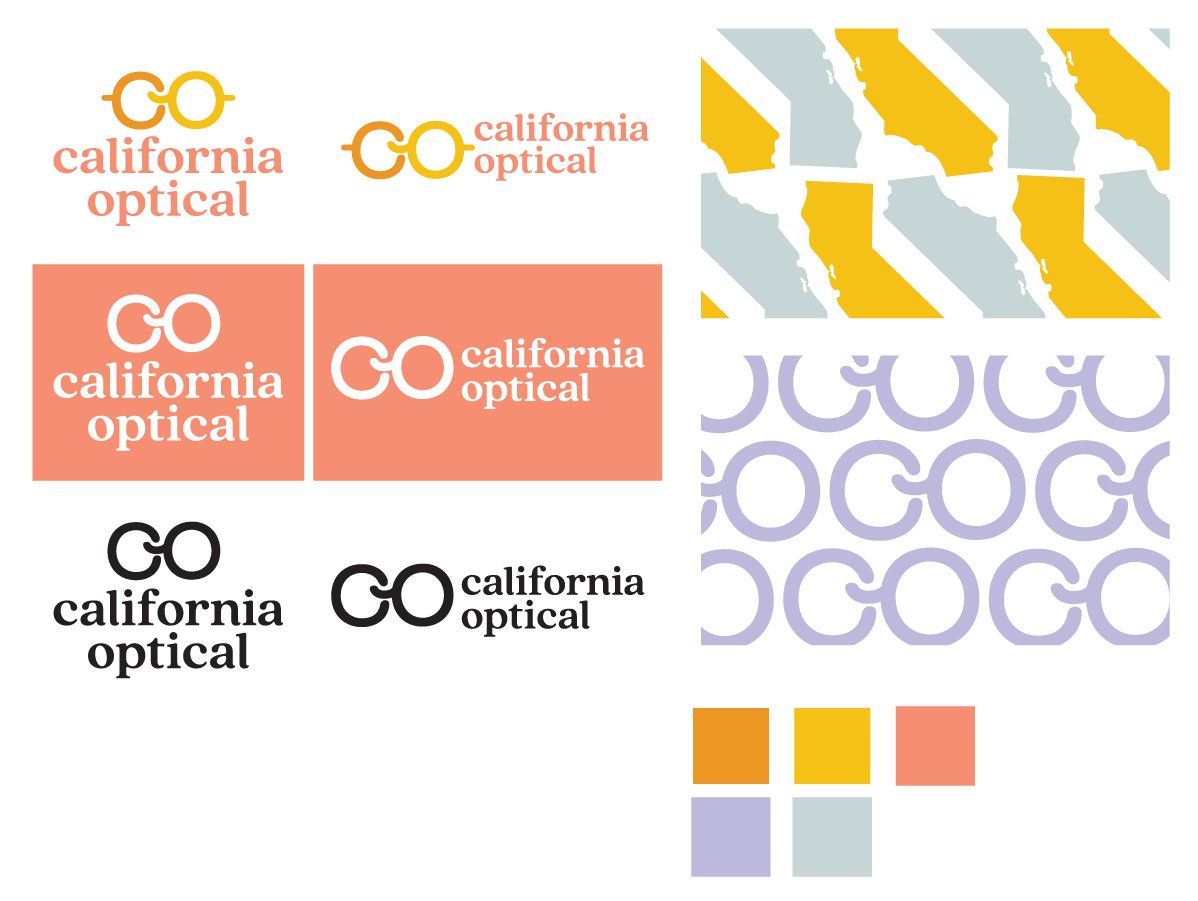

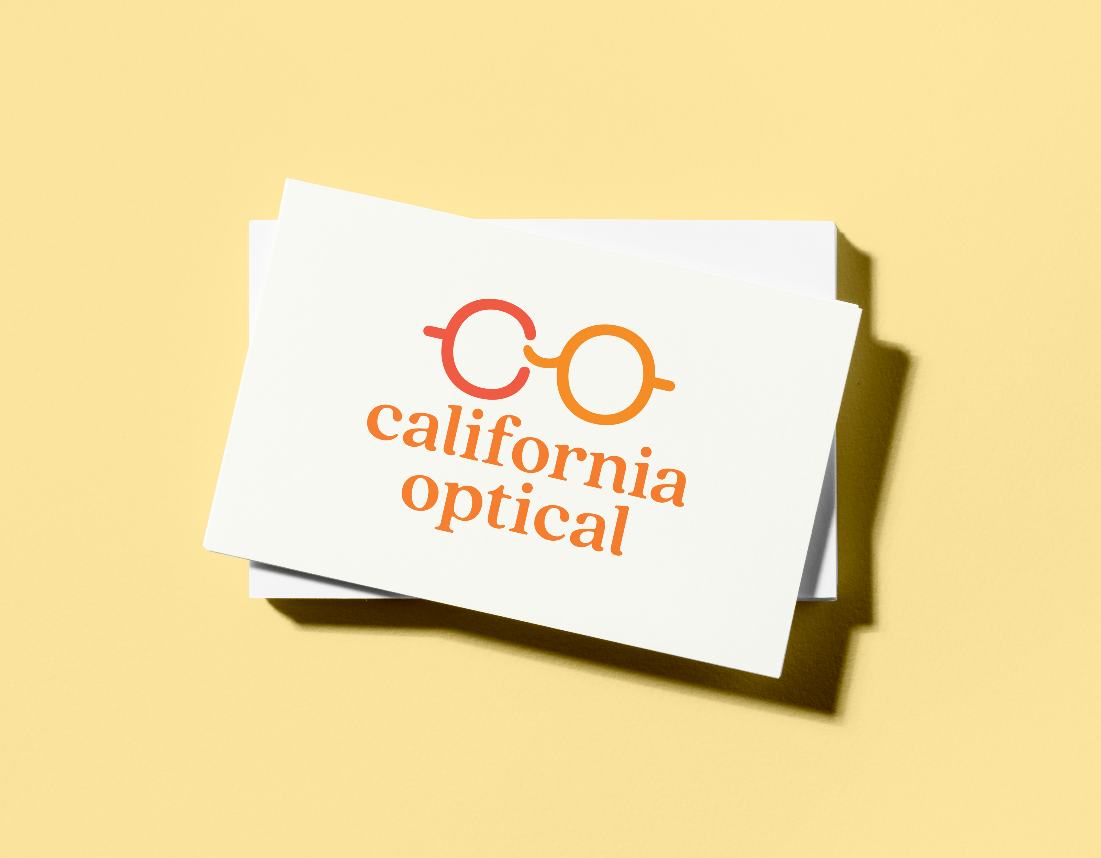
IV. Final Options
With feedback from the client, I developed a final set of options and color variations which were then used to decide on the final mark.